Visual Literacy: Photo Series Draft One “Snow Day on the Farm”
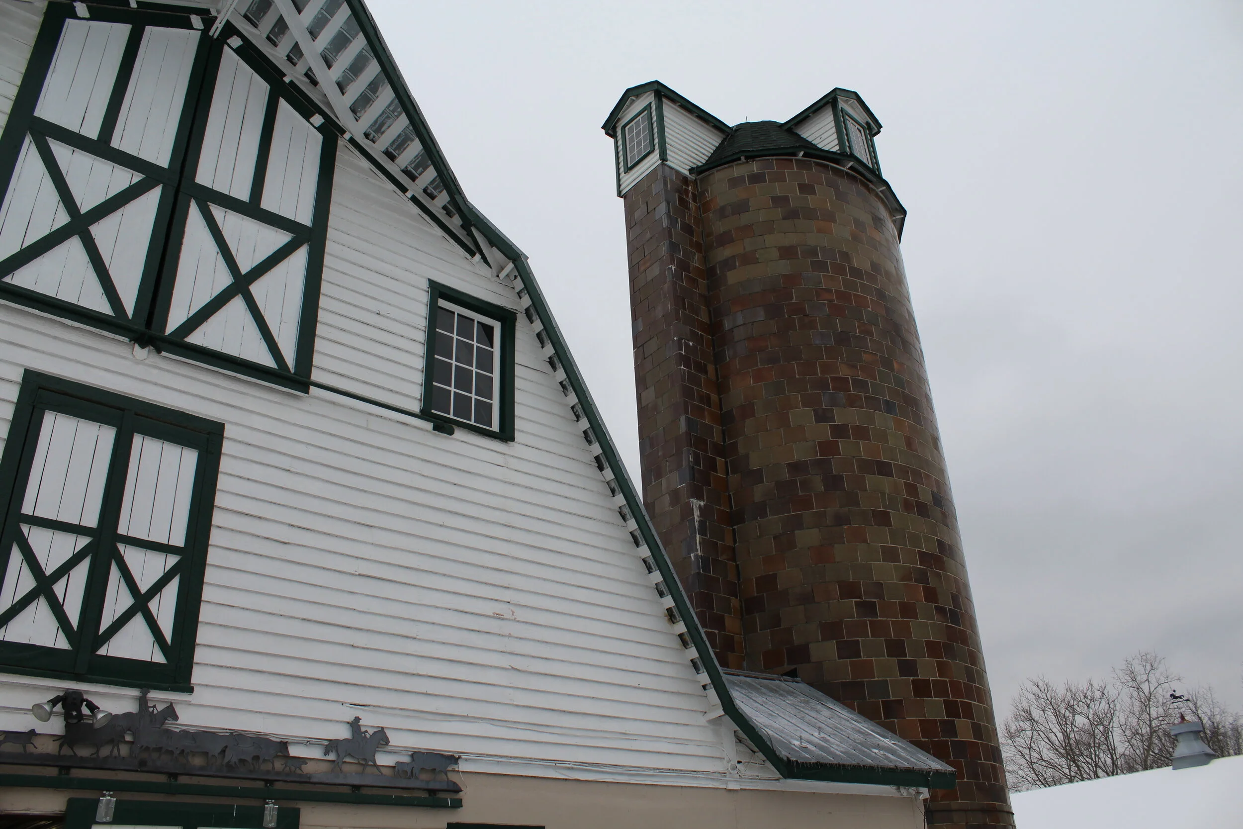
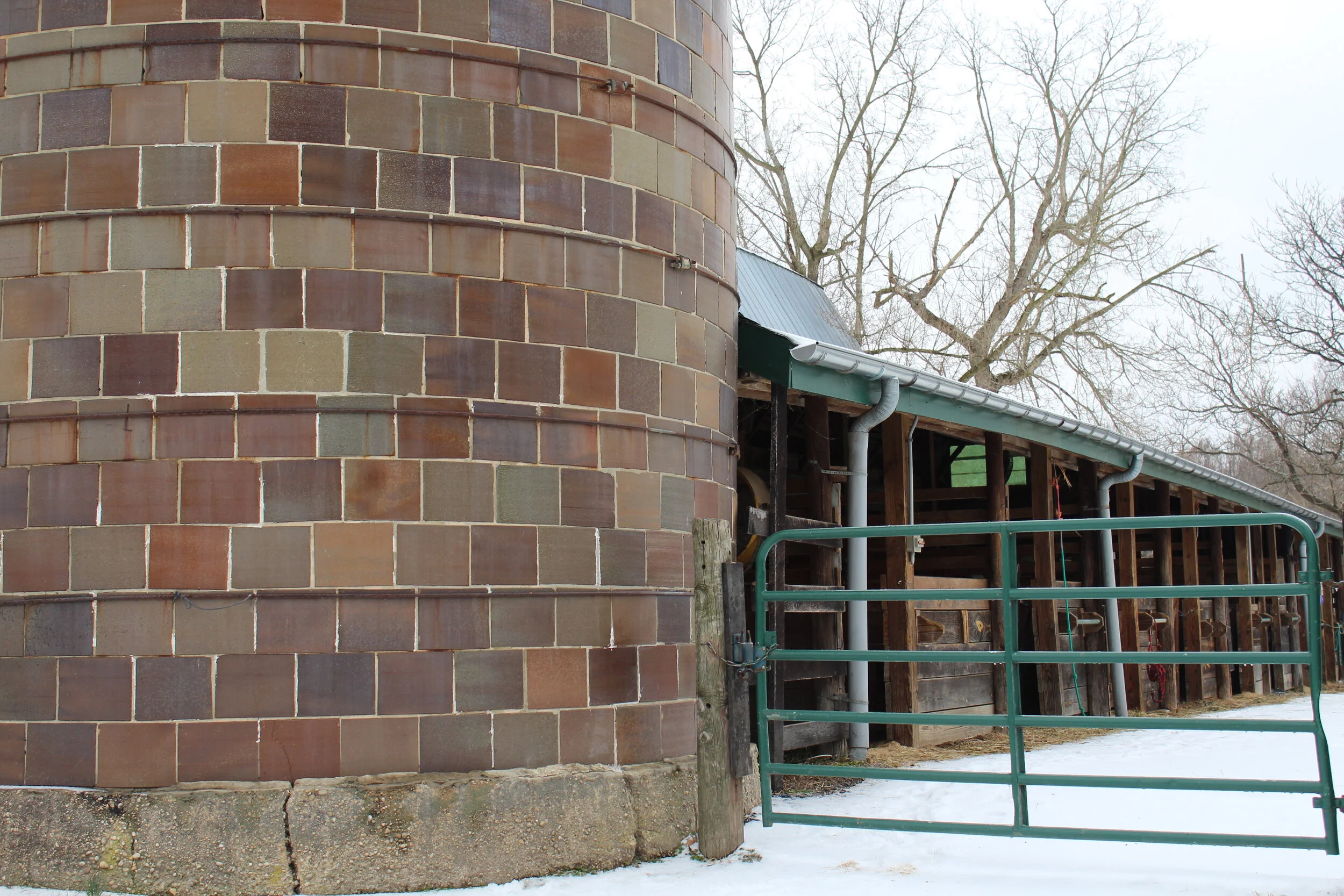
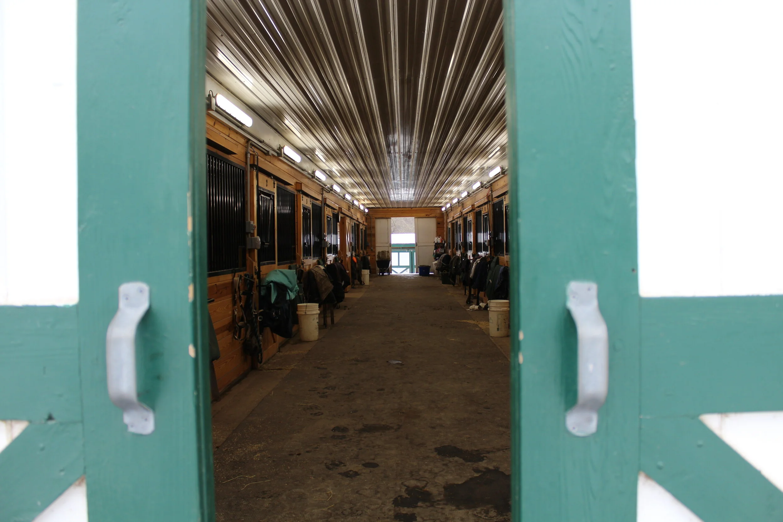
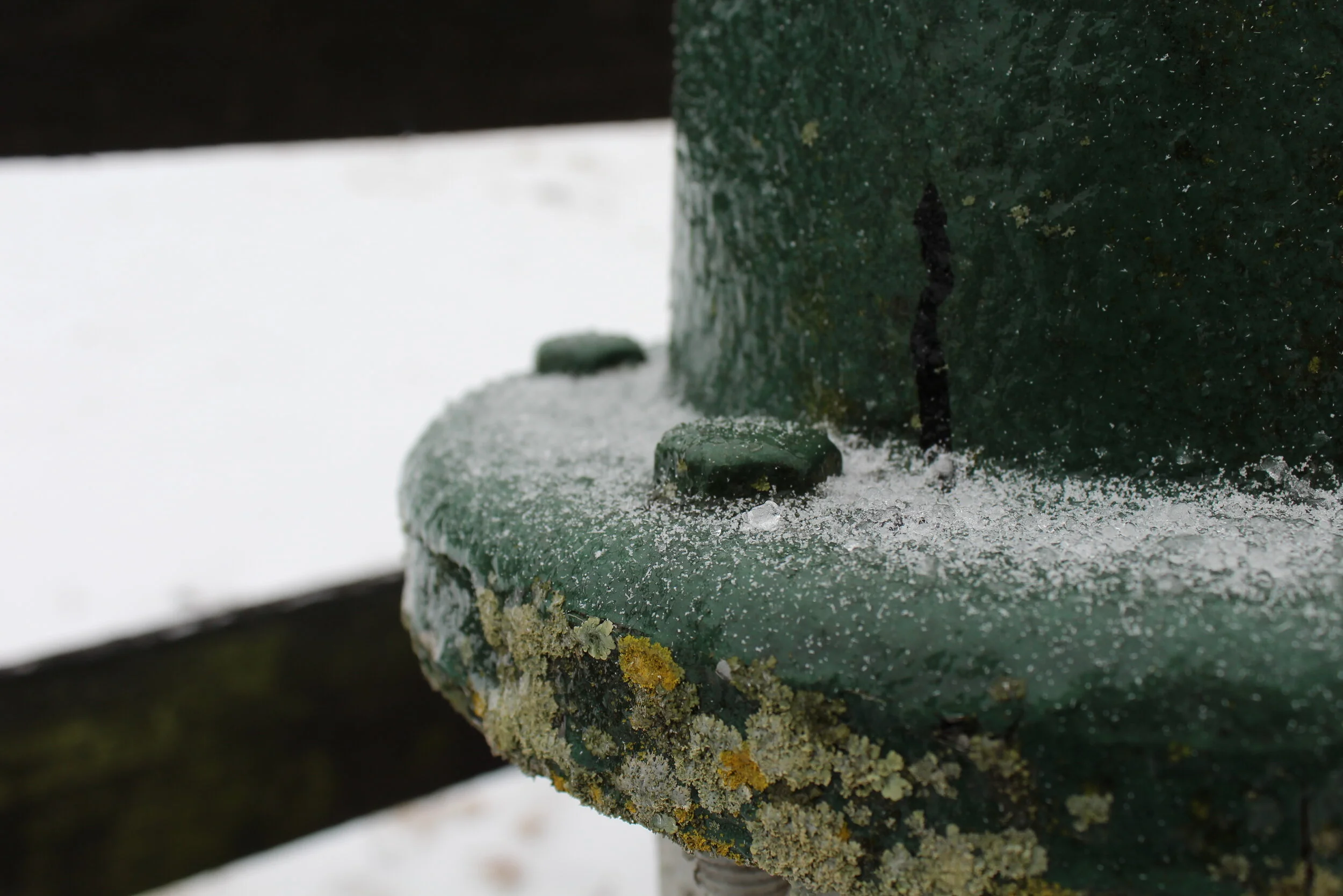
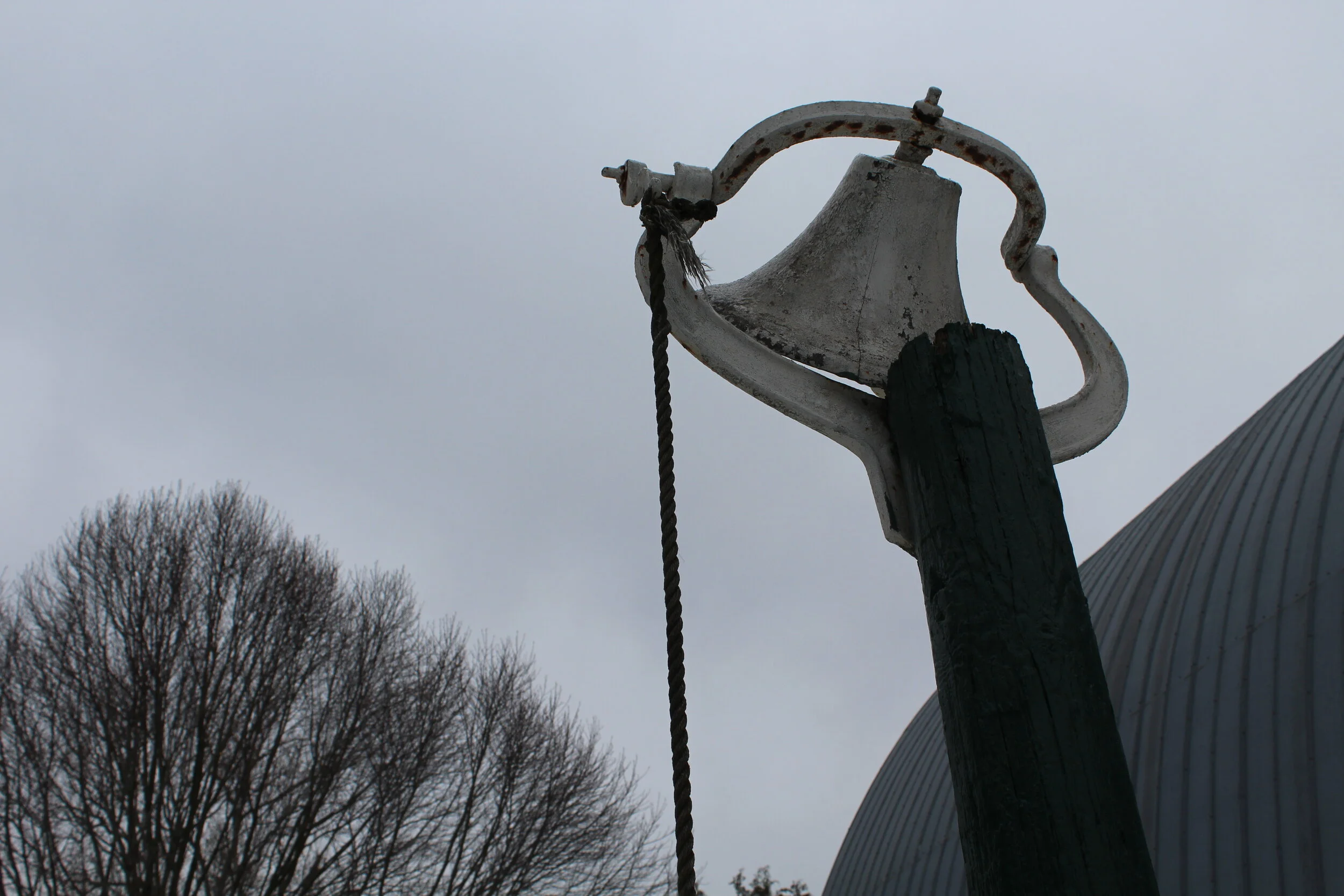
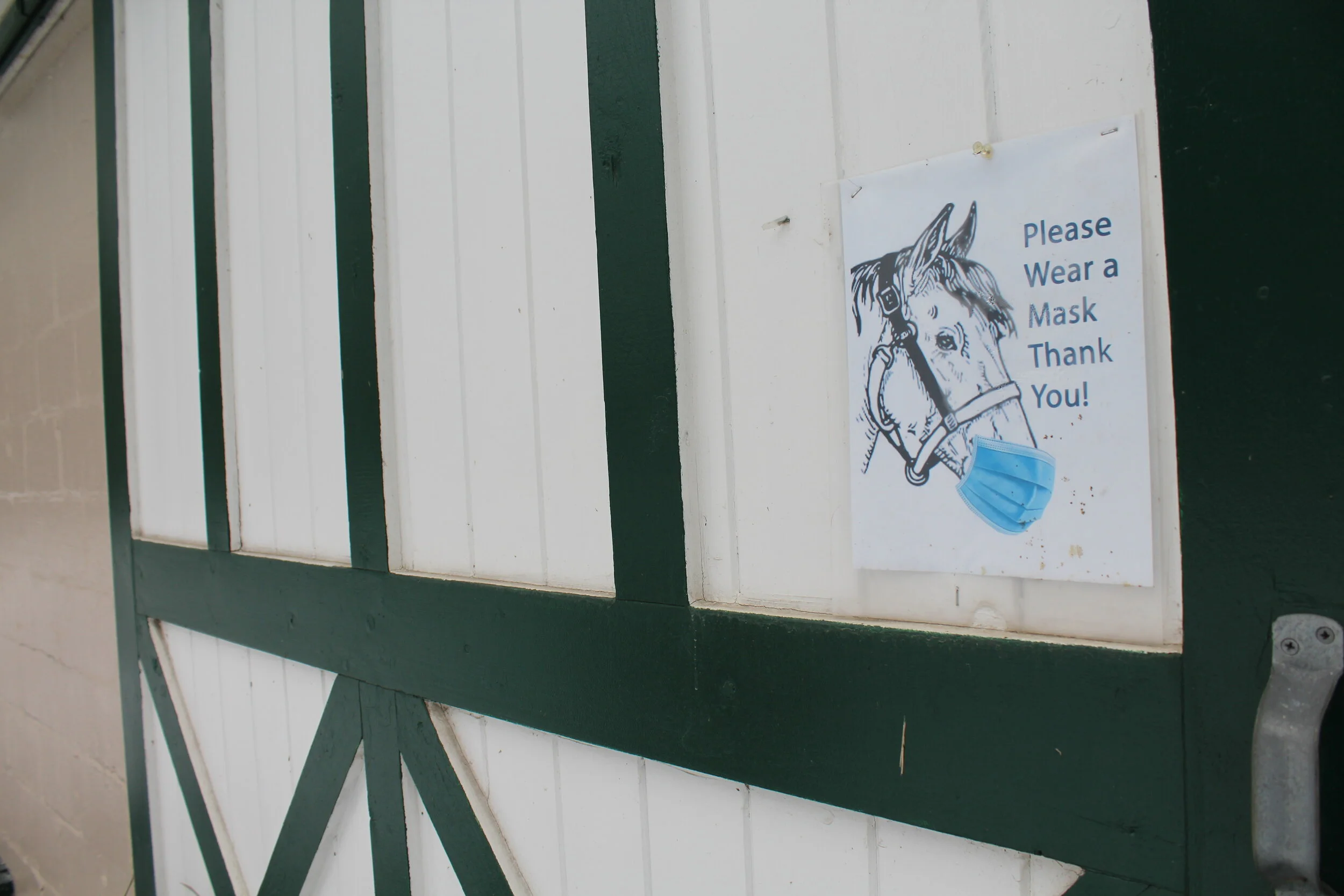
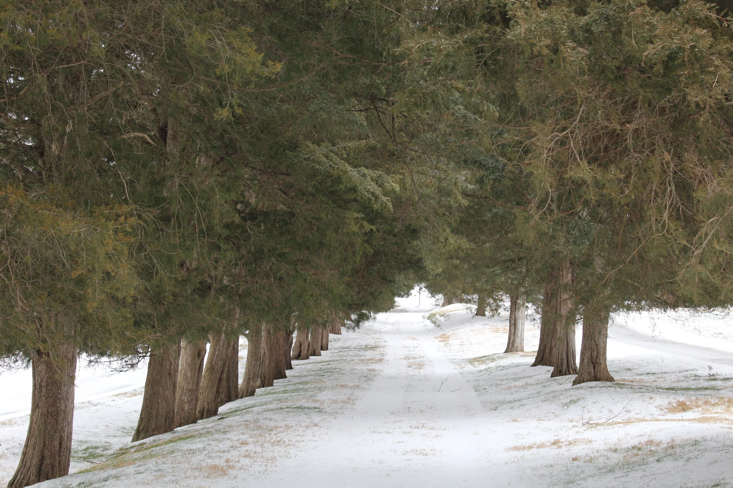
Since I was three, I have grown up on Merry-Go-Round Farm in Potomac, MD. Throughout my photo series, I wanted to capture the beauty of the landscape as well as my favorite places around the barns. The image I took looking into the barn really captures the depth and the green on the doors gives the image a pop of color. Next, I really liked the decaying wood on the side of the barn because of all of the different textures and lines even though it is very monochromatic. Finally, I thought the bell image captured the motion of the bell swaying in the wind. I also liked this image because the bell has significance from my childhood.
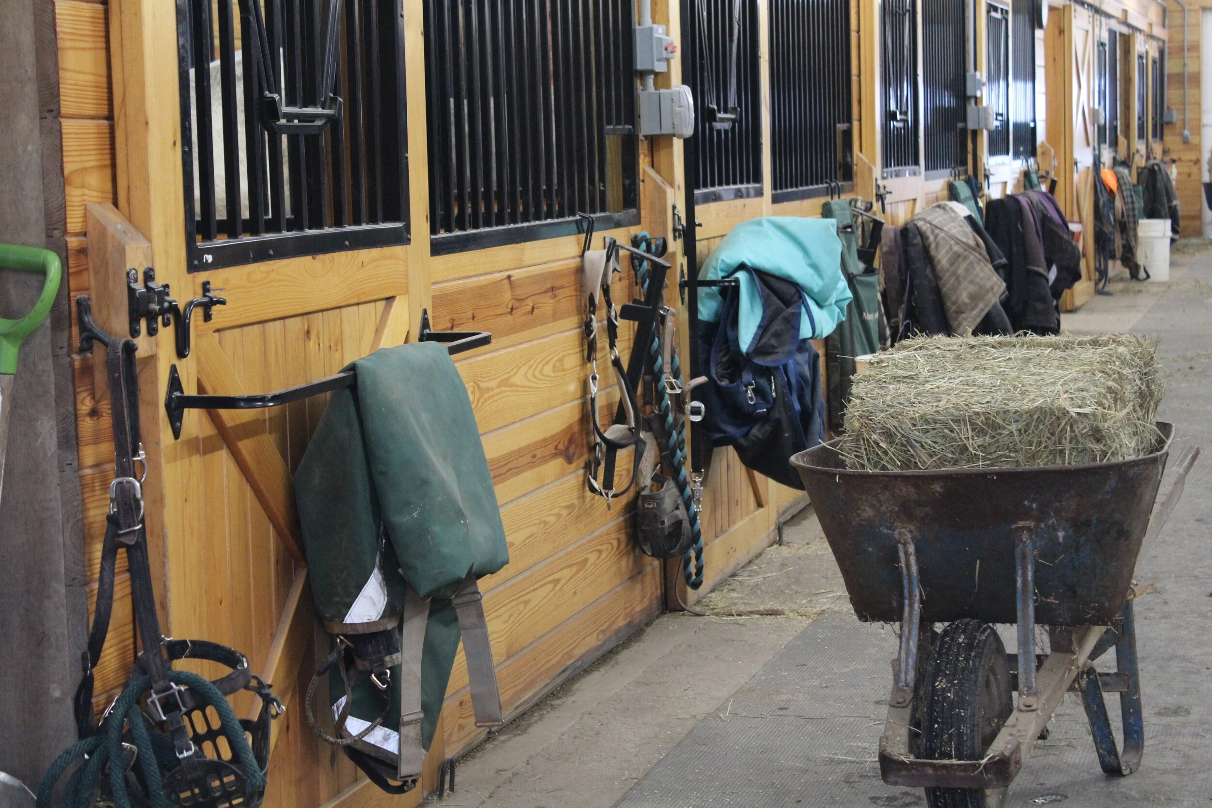
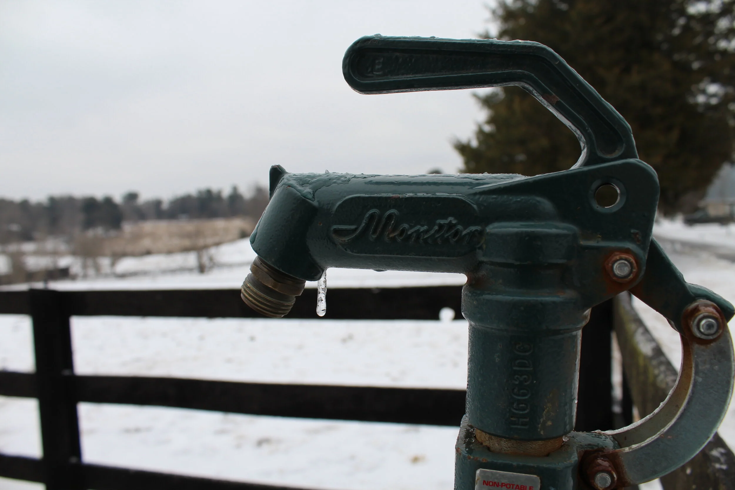
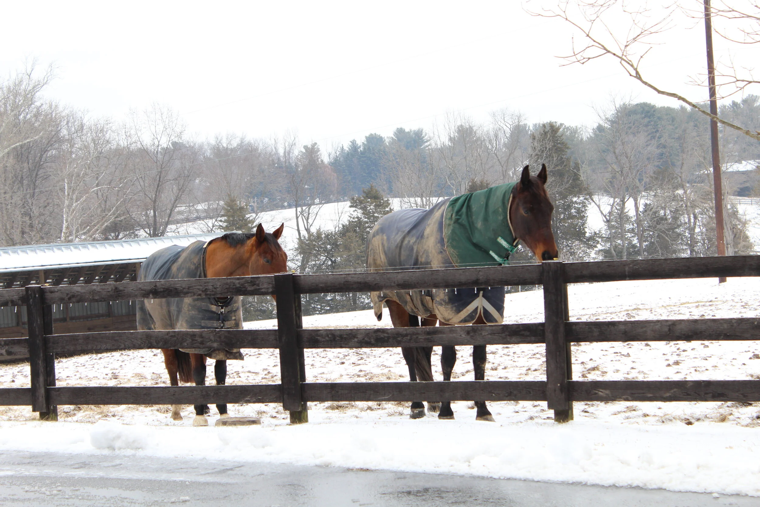
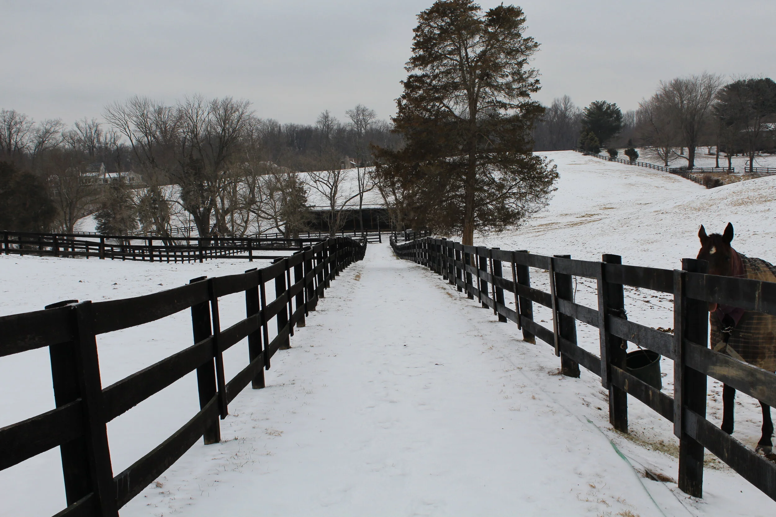
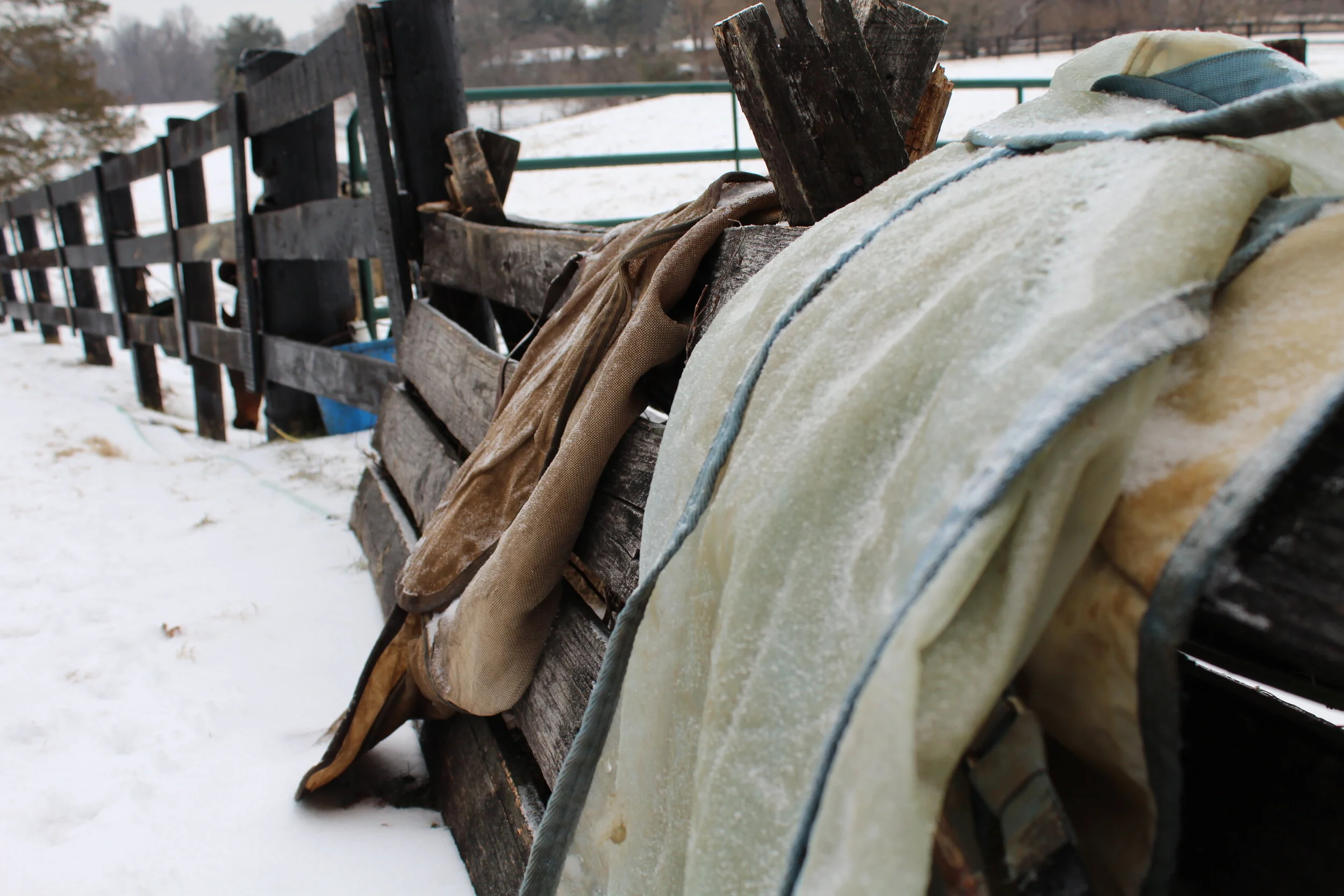
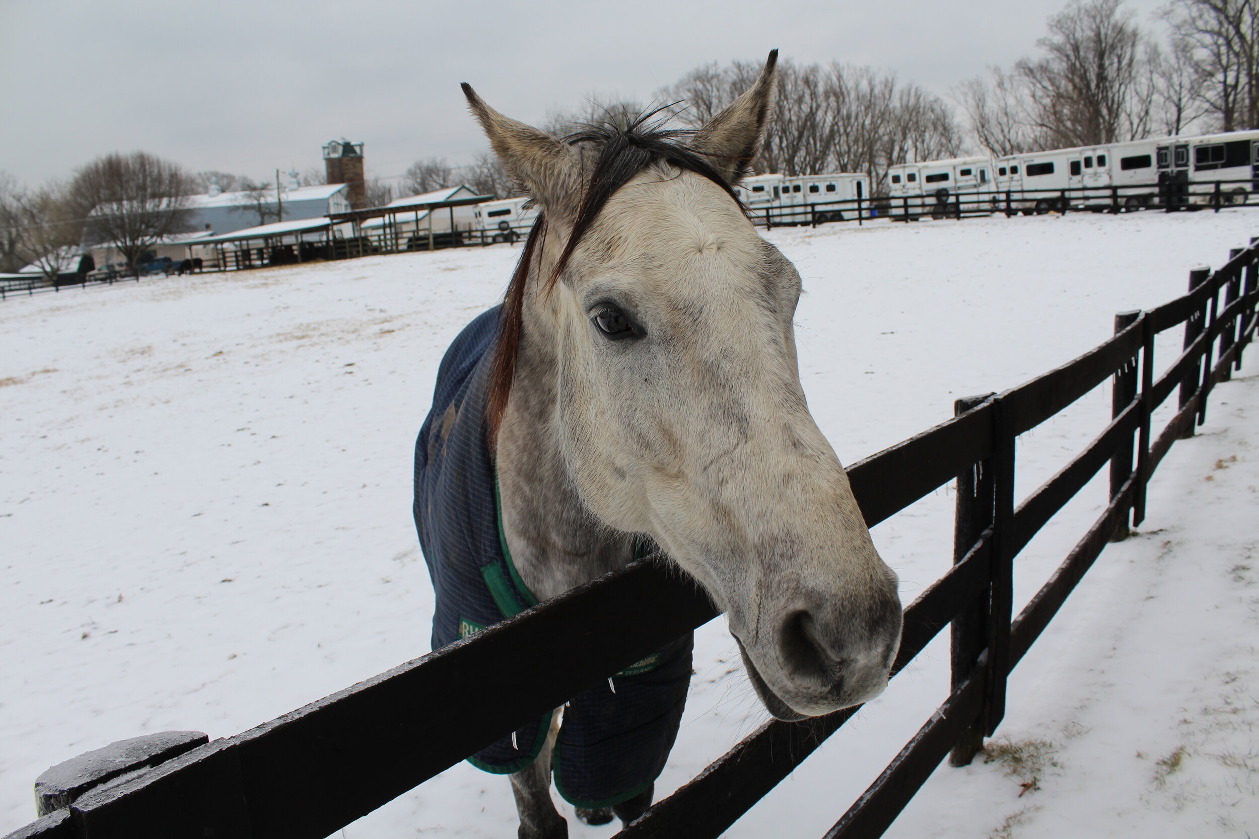
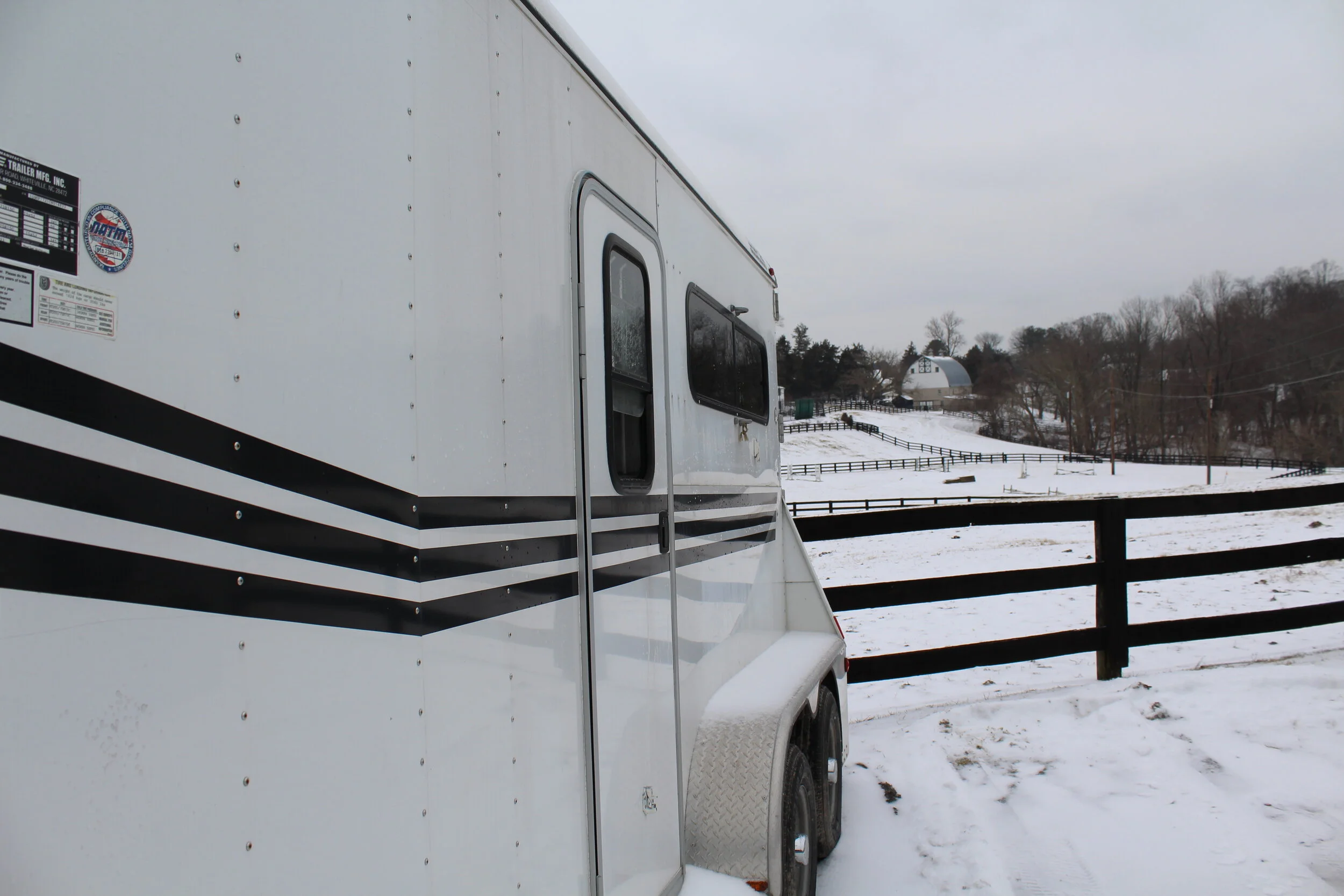
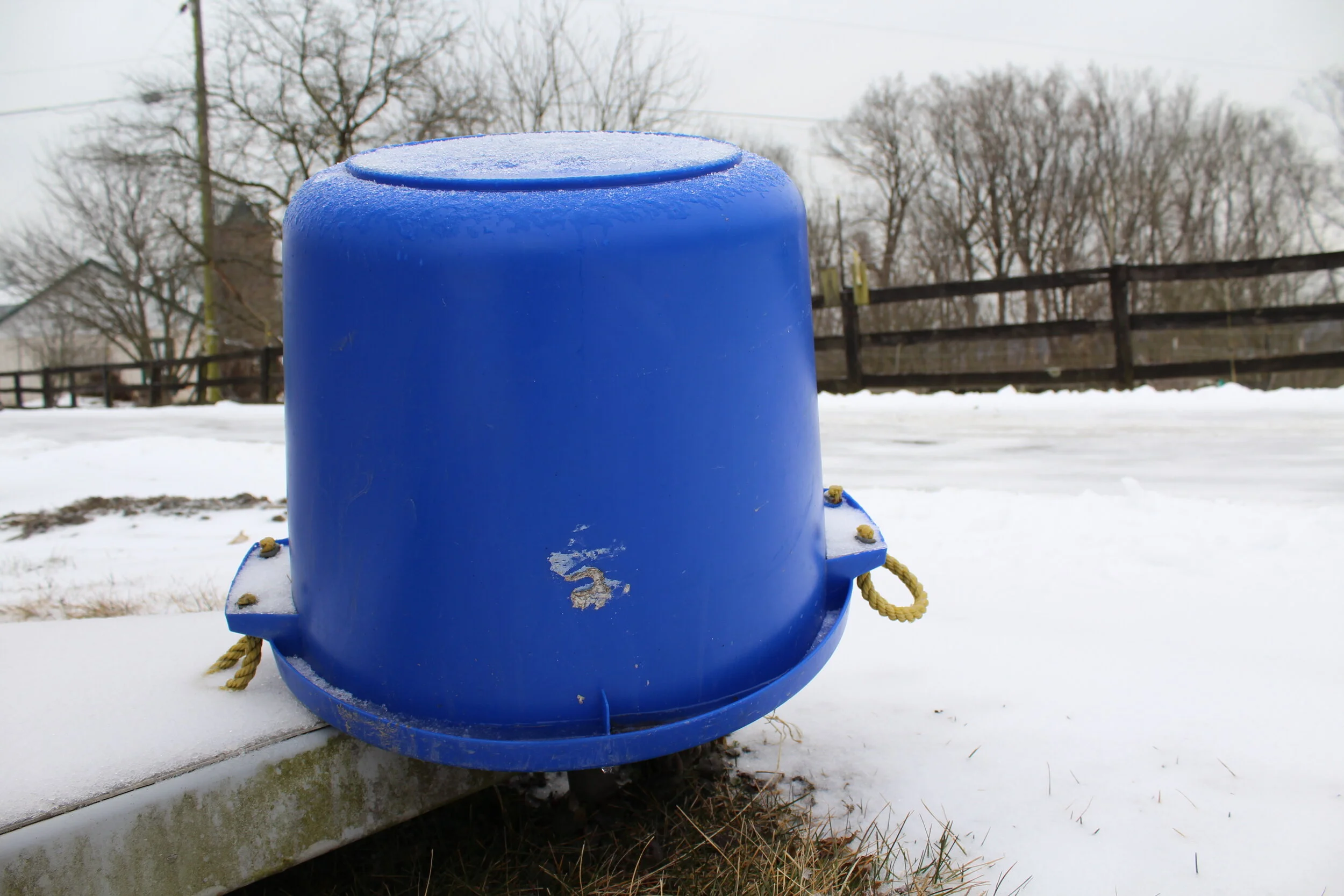
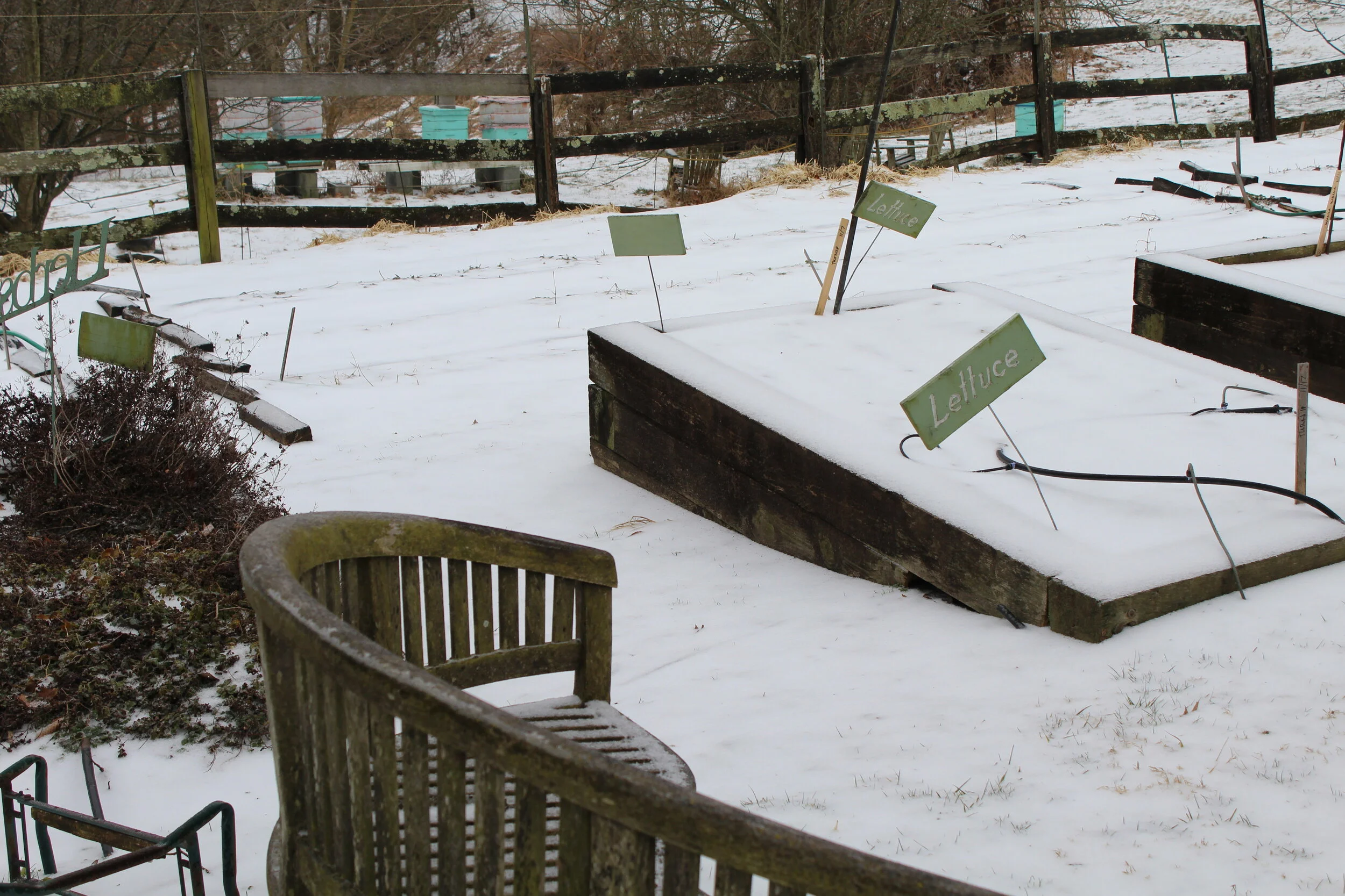
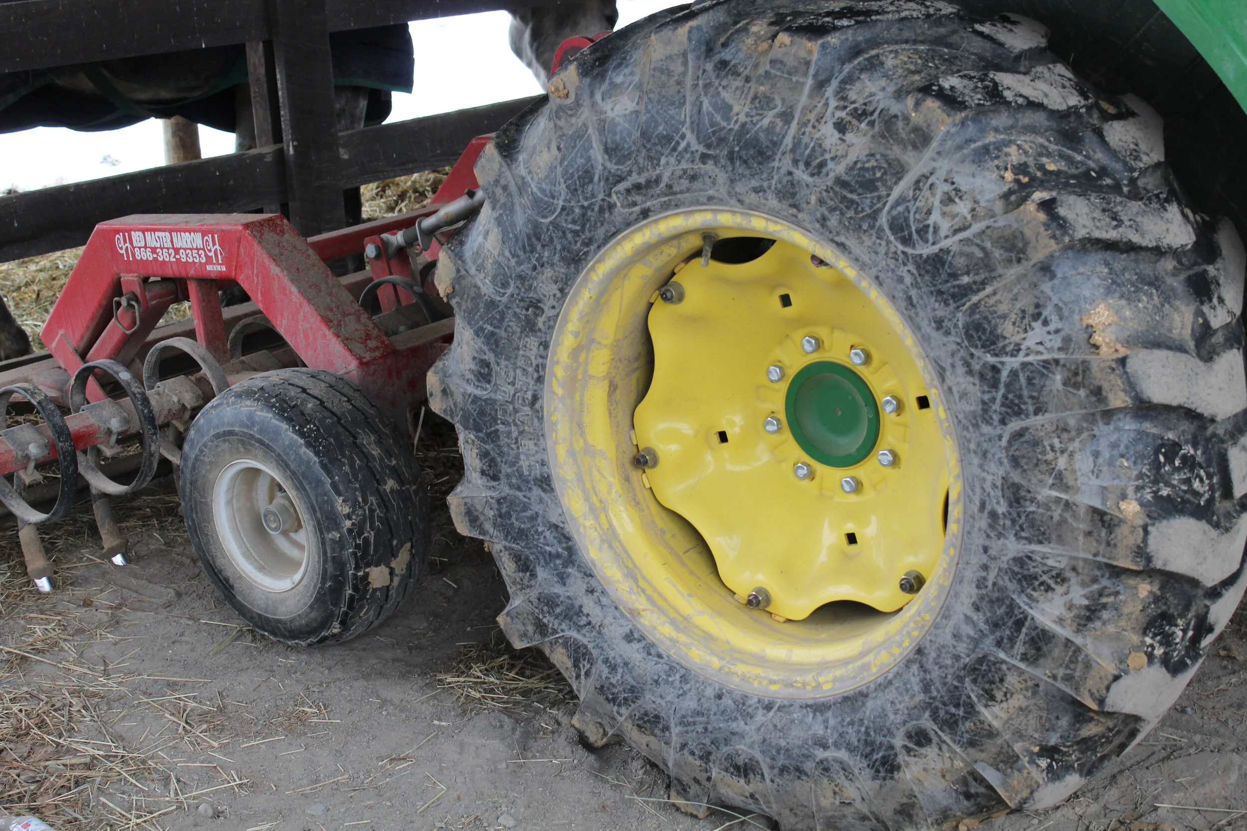
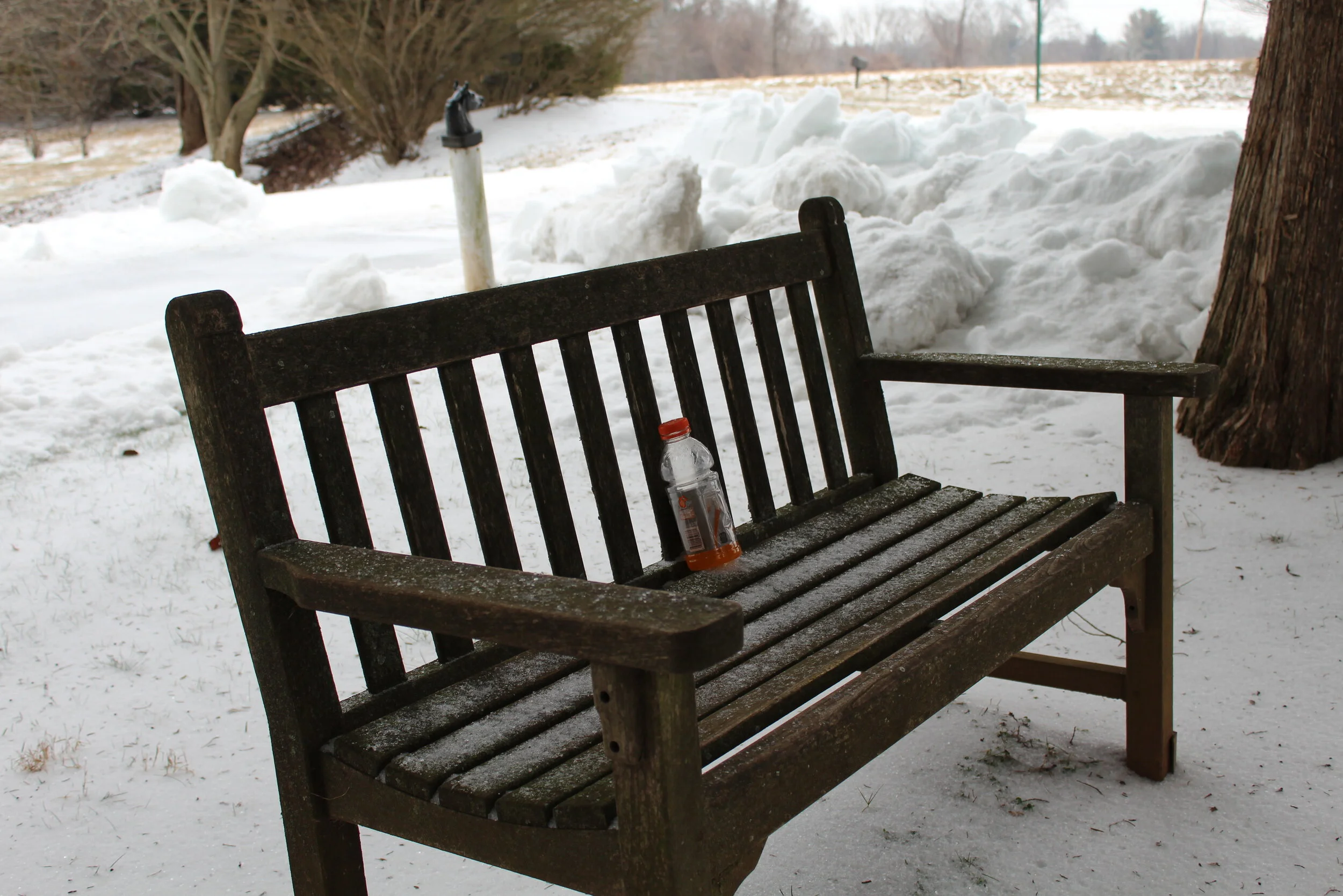
In my final photo series, I wanted to convey the silence and stillness of a snow day in my neighborhood, Merry-Go-Round Farm. Since I was three years old, I have lived on Merry-Go-Round Farm and I have so many memories with friends represented in the images I took. I wanted to take the viewers on a journey around the farm, so I start my series with the outside of the barn. I then take you inside. I think one of the successes of this series is that I never feature anyone in the images, so it makes the silence and stillness come through even more. An image that I think captures stillness the best is the frozen water droplet on one of the outside faucets. Finally, I end my series with a horse because it is a horse farm and I really liked the coloring of the horse against the snow because it keeps with the color scheme of the series. I also liked the last image because of all of the uses of line as well as a view of the barn which was the starting image of my series.
Visual Literacy: Final Photo Series
Visual Literacy: Photo Deconstruction

“Men Atop a Skyscraper”
The image above is titled “Men Atop a Skyscraper”, also known as “Men at Lunch”. This image does not have a photographer associated with it, but it often comes up that this image was done by Lewis Hine. The image depicts workers taking a lunch break high above the New York skyline on a single beam during the construction of the Rockefeller Center skyscraper in 1932. In the 1930s, the Great Depression was taking place. This photo represents the spirit of American workers constructing a modern city. Many workers were immigrants who took hazardous jobs to make a living for their families. Their work also contributed to America’s growth. The steel beam in the image represents American industry. Steel frames made construction more efficient and were a vital part of the iconic skyscrapers built in the 20th century. It was later revealed that the photographer posed the workers on the beam as part of an advertising shoot.
Although all images from this time were always black and white, I think it adds to the emotion of the image. I do not think there is any variation on the black and white, but I do think the cloud behind the men makes the image feel like there is a high key variation placed on the image. The black and white of the image also brings out minor details I do not think the viewer would have focused on if the image was in color. I have often wondered what this picture would feel like in color, but I honestly think it would change the message and emotion of the image. Some details that I think the black and white made pop are the different shaped windows on the buildings, the cars on the street, and the curved/irregular lines that are present on the structures of some of the buildings.
The use of line in this image is also very intriguing. The focal point of the image is the men lined up on the steel beam horizontally across the image. However, the focal point is obstructed by the diagonal rope in the right third of the image. To the right of the diagonal rope, there is almost a parallel diagonal line that is formed by the street running through Central Park. As I mentioned before, there are also a lot of details using lines including the windows, shapes of the buildings, and the rooftops. The Hudson River that runs through the upper left and middle third of the image creates another line that almost frames the city in the distance and Central Park with the steel beam. Another place where framing could be seen is where the buildings in the left/middle third of the building outline the left side of Central Park and the beam with the men on it creates the bottom portion of the frame.
In terms of focus in the image, it is obvious that the main focus is on the men, the beam, and the city directly under them. I think that the men are so high up that there is a cloud passing behind them creating an out-of-focus/blurred background. I really like the effect this cloud adds to the image, but as I mentioned before with the idea of color, if the cloud was not in the image, there would have possibly been a different feeling. The background might have been too busy taking some of the focus away from the men. Overall, I feel like the composition is very uniform. Although the rope cuts in front of the men and the buildings and the emptiness of Central Park happens suddenly, all of the elements work together to create a story.
Source for historical background: https://www.washingtonpost.com/history/2019/09/01/one-most-iconic-photos-american-workers-is-not-what-it-seems/
